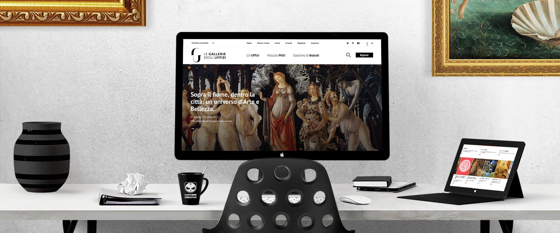
The Uffizi Galleries: a new, user-friendly website
By placing humans at the center, mirroring the founding principle of historic humanism, the development and design of the website focused on the user as the central element of the browsing experience. We wanted to develop a tool that would prove useful to anyone wishing to discover the treasures of the Uffizi Galleries, avoiding the temptation of creating a website that merely served as a self-aggrandizing showcase.
Here at LeanPanda, a Florence-based web agency specializing in visual design and web development, we have worked closely with the Communications Department and Director Schmidt as a cohesive team. We conducted usability workshops and adopted flexible development approaches to help us to choose the features we wanted to develop each day, leading us to this first version of the website.
I remember my first meeting with Director Schmidt very clearly. We wanted to understand his general vision for the Uffizi Galleries project, which would obviously affect the development of the new website, and when discussing the task of transforming a museum of such national and international importance I remember his enthusiasm to simply “get things right”. I was particularly struck by two things: first, his wish to create a modern, clear and clean website inspired by the simplified geometry of the Florentine Renaissance and the two-tone style of the artist Vasari. Secondly, it was his desire to recreate, in terms of content and approach, the depth of cultural modernity which so many people have worked to develop throughout the history of this place.
By placing humans at the center, mirroring the founding principle of historic humanism, the development and design of the website focused on the user as the central element of the browsing experience. We wanted to develop a tool that would prove useful to anyone wishing to discover the treasures of the Uffizi Galleries, avoiding the temptation of creating a website that merely served as a self-aggrandizing showcase.
The apparent simplicity of the site has been achieved through a careful study of computer architecture and visitor usability, while the chosen design opens up numerous doors for the future evolution of the publishing platform. The CMS (Content Management System) has been designed and built ad hoc to help adapt the content to families, users with disabilities, schools and academics, working transversally with the museums, collections, works, programs, events and this magazine. The static sections we are accustomed to have gone, making room for dynamic structures which evolve and develop day after day.
The virtual exhibitions are a practical example of this dynamic approach: they are aimed at a vast audience of academics, enthusiasts, the mildly interested or passing tourists, each with very different levels of interest and knowledge. Consequently, the exhibitions are put together by scientific curators, trained museum assistants and experts, rather than by the marketing department which obviously needs to promote the image and events of the various museums. The virtual exhibitions are one of the ways in which we can explain and point out hidden details in the some of the great works, as well as drawing attention to works which are less well-known but no less lacking in significance or beauty. These works are spread out over a museum complex that extends across three buildings and countless collections, and one of the key goals of the website is to help visitors to get their bearings and to rightfully restore visibility to the Pitti Palace and the Boboli Gardens, marvelous wonders that deserve to be discovered the world over.
As part of the Museum Digital Transformation conference, we had the opportunity to meet the marketing and communications managers from leading institutes such as the British Museum, the Rijksmuseum and the New York Metropolitan Museum, sharing our experiences and opinions on the important role the Internet plays in this sector. We were struck by the huge amount of investment that these institutes devote to creativity and innovation, with the aim of reaching an ever greater audience. For a museum of the caliber of the Uffizi Galleries, a positive comparison with these international museums is a key objective that cannot be achieved with any single action or in too short a time frame. It is a process that requires the laying of solid technological and cultural foundations, embracing the changes which are already developing on a global level. In this first version of the new site, we have combined all the ingredients of an important media-focused revolution: a new brand, a design created by the Carmi e Uberti foundation which offers a clear break from the old format, a solid, latest-generation technological structure, and the direct involvement of those with the necessary skills to truly express this internationally important heritage.
As an agency with a strong emphasis on ethics and quality, we were unable to ignore the severe criticisms directed by the media at the general website standard of Florence's museums. We have worked hard to show yet again that it is possible to “get things right”, even if the road is long, winding and fraught with obstacles.
For us, born and bred with a sense of Florentine pride, it has been a great honor to be able to contribute to the history of this city.
